
In-n-Out Website Redesign
Team: Jennifer Yoo
Tools: Adobe Illustrator, Sketch, Invision,
Platform: Web
Timeline: 2 Week of Research, 2 Weeks of Design, Prototyping, Testing, & Iterations
Brief & Overview
This project is not affiliated with In-n-Out. The following work is a conceptual educational exercise to practice and refine UX Skills.
Southern California’s beloved in-n-out burger restaurant exceeds expectation in their quality of food and service and the In-n-out in-n-out’s e-commerce website should reflect those qualities.
UX Process

What I did
Why I did it
What I learned

Research
Screener/ interview
What I did
Asked a series of questions to gain insights, information, and an understanding of problems.
Why I did it
To find target users, and to get specific targeted
information from those users.
What I learned
Most interviewees were not utalizing the tools readily availble to them. the site isn't effecient or easy to use.
Screeners
Screeners, the initial interview to weed out users who are not our target audience. I found that the majority of our users didn't pass the screeners. This was not the ideal outcome.
Interviews
From the interview, I discovered that our users were wishing for functions to make their item purchase easier. Functions that WERE available. This told me that users were unable to find these features.
Proto Persona
What I did
Creating a visual representation of the summation of our users.
Why I did it
To empathize with our users. and make sure we are designing/ creating for our persona.
What I learned
Most of our users were under 40 yrs old and all had experience shopping online. All expected this task to be easy.


Other shirts that Shannon own
Shannon
She is a young, not as healthy as she can be; tomboy. She avoids the “frilly” “lacey” stuff and goes straight to the graphic tees. In her closet she would have the iconic Coca-Cola T-shirt, Nike swoosh shirt, etc. Her style is very tomboy, colorful and simple. She wants to express her love for her FAVORITE burger place. What perfect way than to get her a T-shirt
Frustration:
- Hates frilly stuff
- Wants brand/ iconic graphic tees but
- getting them is a hassle.
Bio:
- California, born and raised,
- 18 year old high school student.
- Lives close enough to in-n-out to go frequently.
- Not the healthiest eater.
- Is active, plays sports, and likes graphic tees.
Goal: Be able to purchase cool graphic tees easily!
Task analysis
What I did
Had users complete a task to observe how they go about completing that task.
Why I did it
To observe any problems, confusions, or unexpected complications that may arise.
What I learned
There were a few confusing navigation names.
Did not want to finish task. Most people were scrolling through all 7-9 pages to find one item.
During the task analysis, which was the observations of users trying to accomplish the deceptively difficult given task of purchasing a shirt under 15 dollars, We noted that users were getting frustrated by its lack of efficiency. The inability to use the features caused users to repeat tasks , start over, go back, and give up.
The red boxes represents repeats, errors, frustrations that users experienced while attempting to complete their task of
purchasing a shirt for under 15$.
Journey Mapping
What I did
Created a visual map that depicts emotional ups and downs our users experience while completing their task.
Why I did it
To empathize with our users.Seeing their struggles
during their task, helps create specific solutions.
What I learned
Users did not know how to use the filter feature.
were not able to easily maneuver through the site.
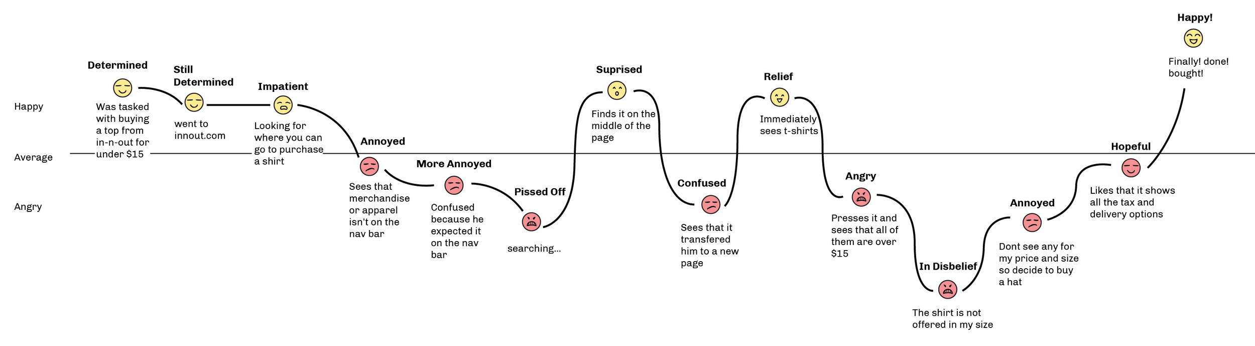
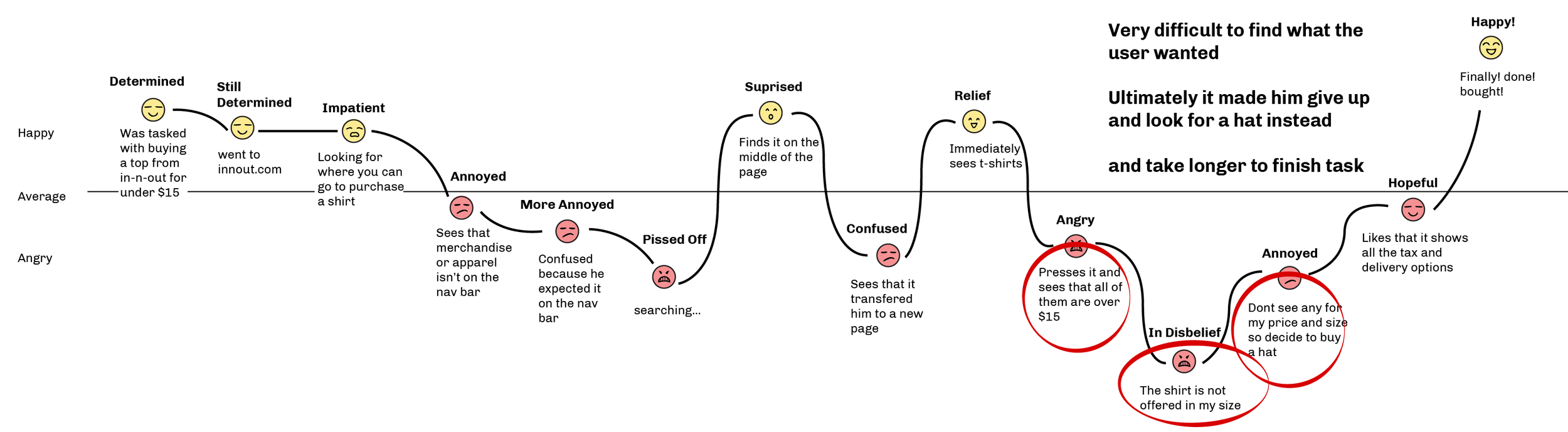
Two main problems stood out to me when doing this journey map.
The first was that features were not where users expected them to be. Thus making it harder for the user to navigate. and take longer to complete their task.
The second was that with the absence of features such as filter, it was very difficult for users to find the item that they wanted.
"It's really annoying that we have to search through all the pages to find what we want. I wish there was a price filter."
-Jean
"What the heck is vault 48? Is that like all the more expensive stuff? I don't understand why things like the wallet and watches aren't under accessories."
-Brandon
"Why are all these shirts so expensive.... theres like none for under 15$. Why can't I use a filter or something?"
-Shannon
Competitive and comparative analysis
What I did
Created a chart comparing ourselves side by side with our competitors.Depicting which features certain company's have and don't have.
Why I did it
To get an understanding of why users would go to their
company instead of ours. To see what our company lacks.
and to see how other companies excel.
What I learned
That In-n-Out actually had the most features. So its not that we lack in features it is that users aren't using the features.
And lastly during the C&C (comparative and competitive analysis) We compared our e-commerce site to that of our competitors. In doing so, I discovered that we had many more features than our competitors. So it was not that we were lacking in any features, it was that users were not able to use the features that were already available.
This influenced my next step in that our biggest priority was fixing the layout, and putting the features in a place that is familiar to what our users are used to.
Card Sort
What I did
Put all pages of a sitemap onto cards (sticky-notes) then asking users to organize it in a way that it makes sense to them
Why I did it
To observe the user's thinking and to find out why the
users organized it in the way they did.
What I learned
Users were confused by the names, and redundancies of the cards.
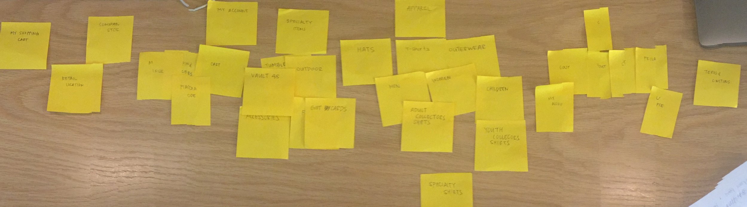
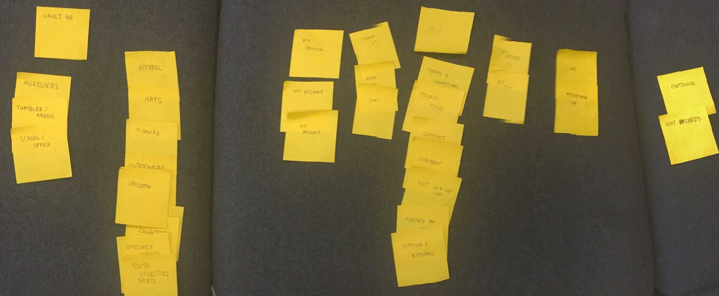
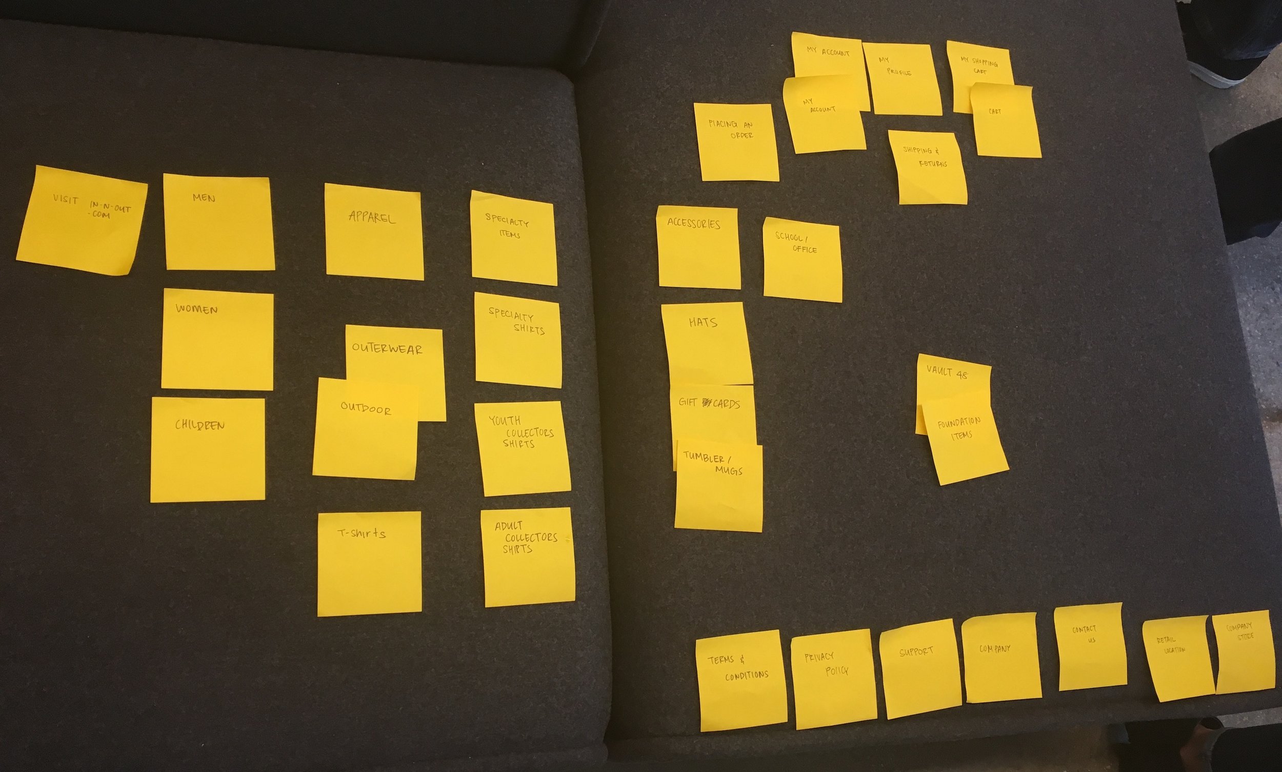
Next I moved into card sorts, in which I put every page of a website (sitemap) on note cards (sticky-notes). With as little influence from me as possible, we asked our users to organize these pages into main pages and sub pages in a way that made sense to them. Now taking the patterns that arose from this testing, and trying to incorporate as many inputs as possible, I made a new sitemap.
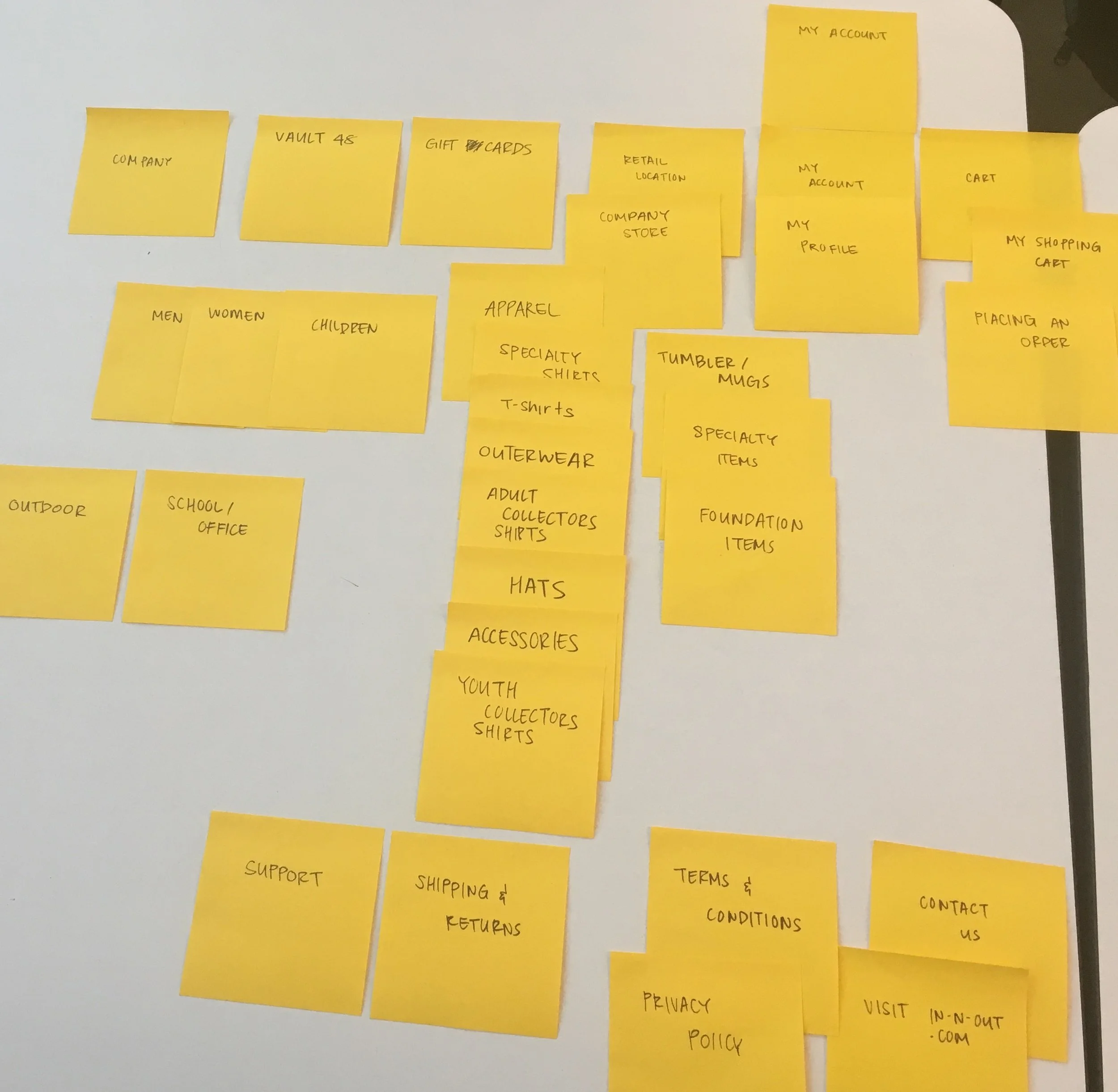
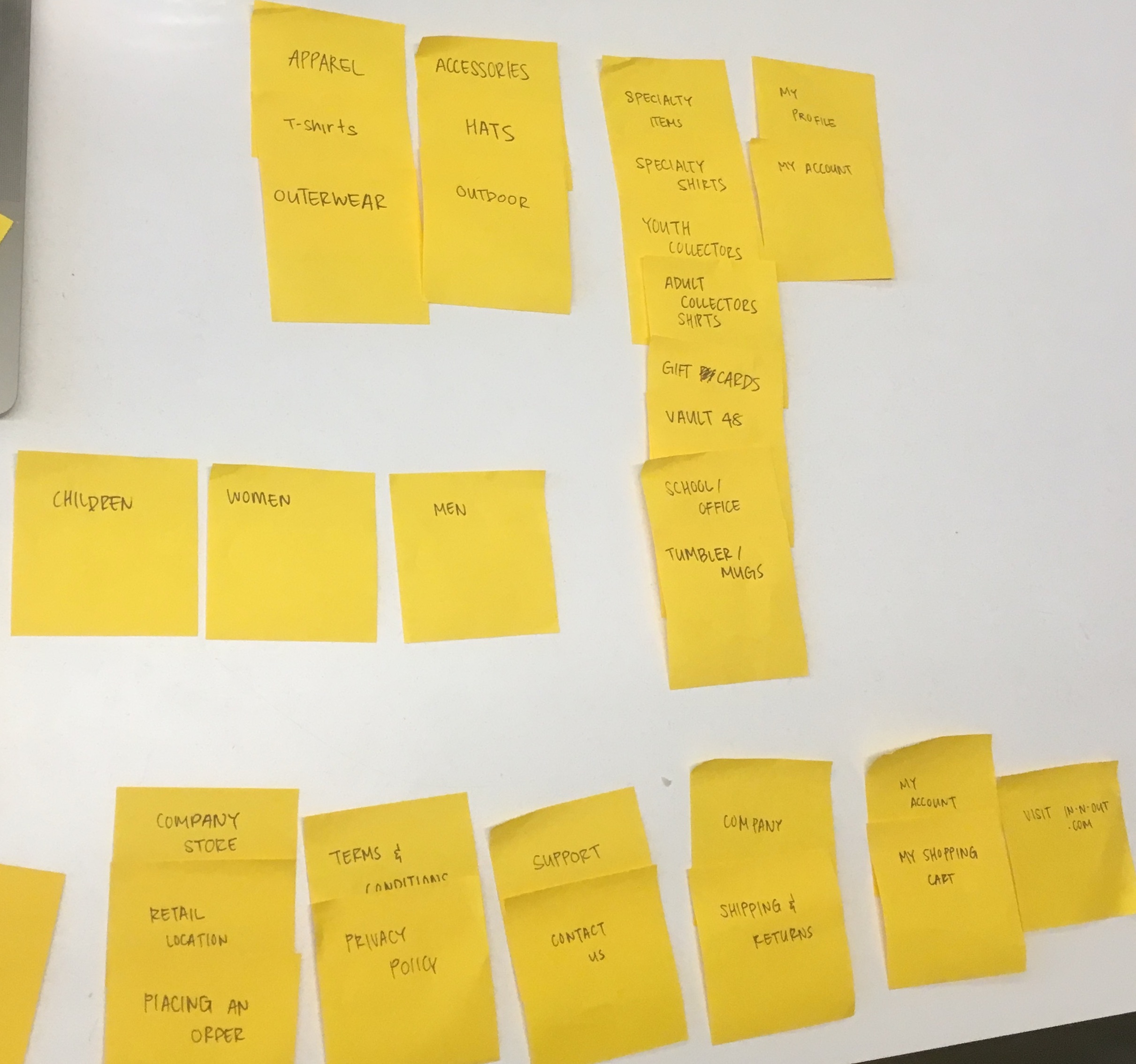
Site Map
What I did
Created a new Navigation Schema and footer, and made a visual blue print of those pages in a site
Why I did it
To update the current navigation schema, and footer
with any changes we made to the names, color etc.
What I learned
That some of the iterations still did not make sense. For example: Collection (formerly vault 48)
A sitemap is a map of your website. It holds a list of all your pages in a hierarchical system that shows you which sub-pages are nested within larger or main pages. What we did was, after gathering the information from the card sort, user interview, and C&C (comparing it to our competitors), we created a new site map with new names, and rearranged pages. These fixes were solutions to some of the confusions our users were facing while trying to complete their task of purchasing a shirt for under $15. These fixes were were tested and iterated multiple times to get the most intuitive, most easily understandable site map possible.


Design
Low fidelity / Wireflow
What I did
Initially sketched basic outline of
how the website will look like. basic shapes like squares as placeholder for images, text, button, logo etc.
Why I did it
Because it is a quick, cheap, and efficient way to start.
Allows you to make mistakes on the hand sketches
instead of on the expensive high fidelity.
What I learned
That you can communicate a lot with low fidelity wireframes. Even without color or text its still relatively clear what everything is.
Next we began flushing out some of our design. We began with low fidelity sketches because its cheap, quick, and a efficient way to get some basic ideas going.
From there we moved to medium fidelity, which was digitizing these low fideility sketches, and getting the information in there
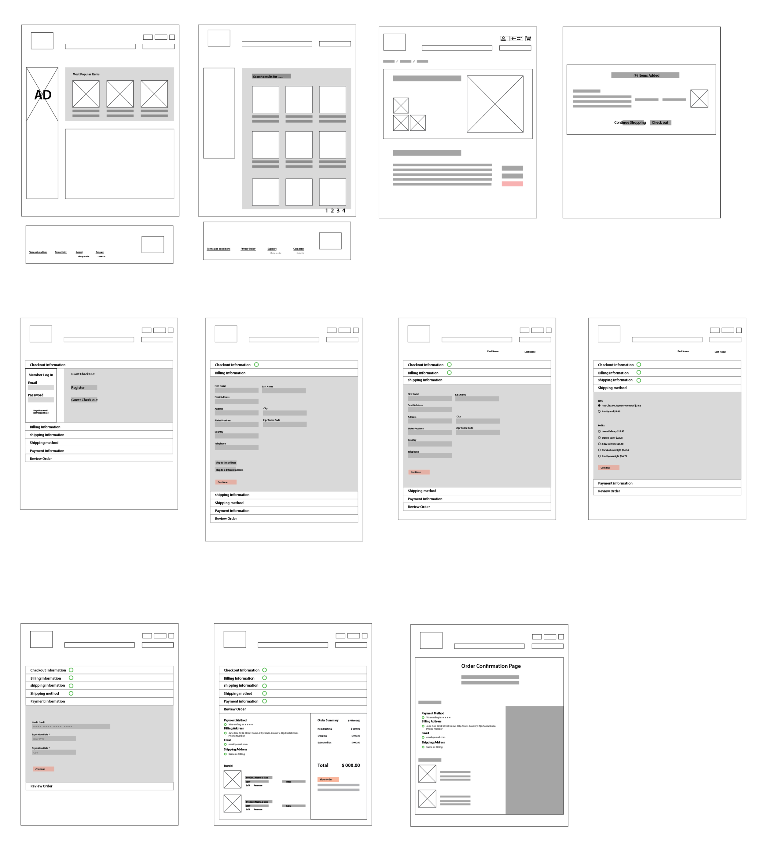
High Fidelity
What I did
Created fully rendered out websites as it would look live. With final fonts, color, any design elements
Why I did it
To have it for the prototype and eventually the live website.
What I learned
When making the low fidelities, although there are no details like color or text, putting more effort into the low fidelity pays of when making the high fidelity.
Lastly, we put some pictures, colors, and overall more information, to make it high fidelity.
Here are a few high fidelity examples of the in-n-out e-commerce sites.
For more please take a look at my prototype

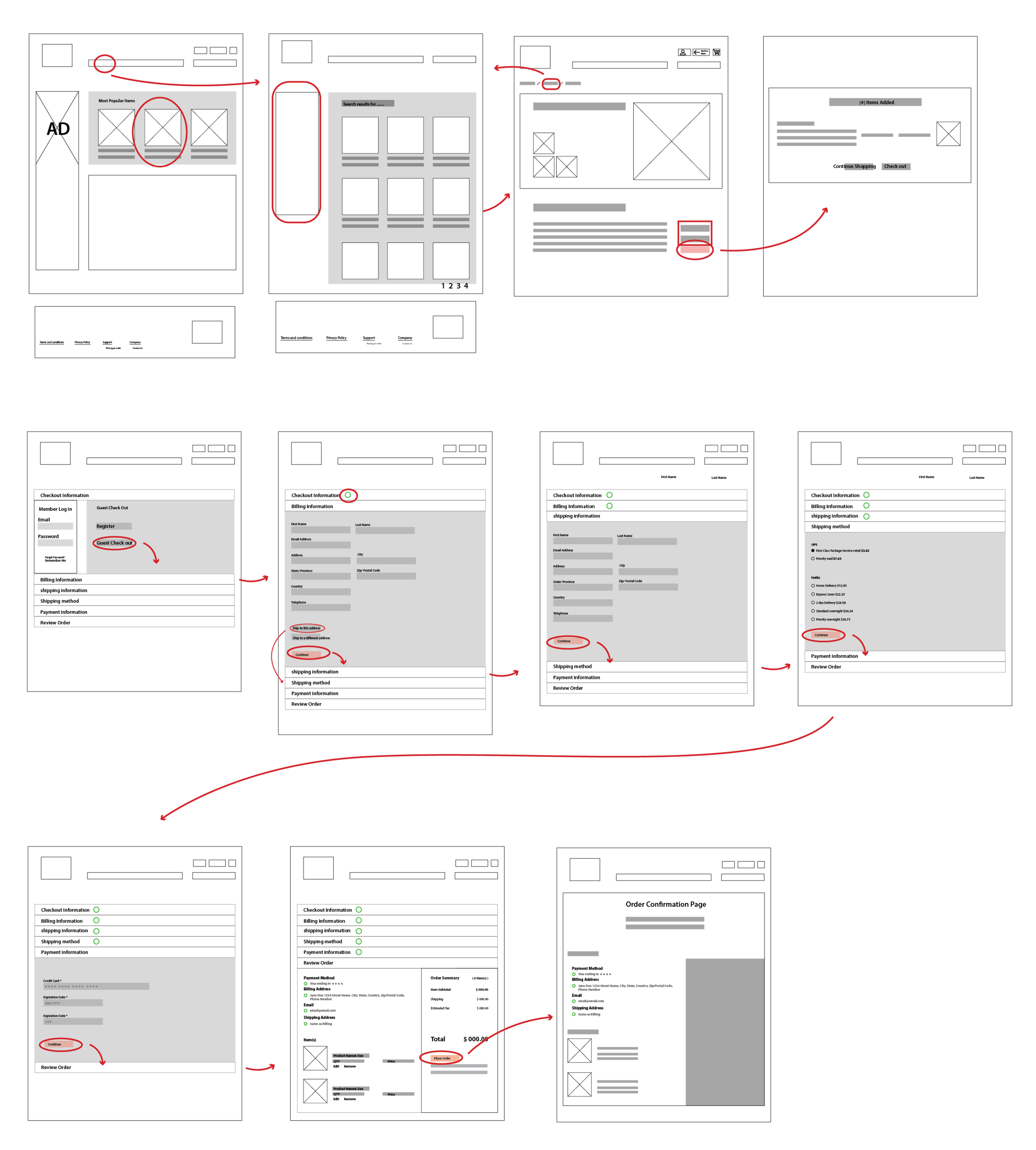
Prototype
Prototyping/ User testing
What I did
Make an early sample, model, or release of a product ... which in this case was prototype of a website.
Why I did it
To test a concept or process or to act as a thing to be replicated or learned from.
What I learned
Its much easier testing the high fidelity prototype than the low. Users thought that the website was very plain so for next steps possibly embellishing it.
Then lastly we made our prototype. Taking the mid/high fidelity I put it in adobe XD and made a basic prototype and we got some users to try them out. Because of time there were not many changes made to the prototype but form the user testing we got different and valuable input.