Taco Bell Kiosk Team

Role: UX/UI Designer
Company: Taco Bell
Tools: Sketch, Adobe Illustrator, Adobe Photoshop, Invision, Slack, After Effects
Platform: Kiosk, POS System
Timeline: 6 Month Contract Position

6 Month Contract Position at Taco Bell Headquarters, located in Irvine, CA
Taco Bell is an American chain of fast food restaurants based in Irvine, California and a subsidiary of Yum! Brands, Inc. Serving more than 2 Billion customers each year, Taco Bell is an iconic brand, that’s devotion to providing the highest quality food prepared with the highest quality ingredients is only matched with, their innovative, ever-growing devotion to technology an design.
I was initially hired to be part of the Kiosk team. The Kiosk, (a small structure in a public area used for providing information or displaying advertisements, often incorporating an interactive display screen or screens, in this case used to browse and purchase food.) have recently been implemented , if not every, the majority of the 7,072 stores.
Spanish Translations

Coming into the project, My first task was to type set the Spanish version of the of the kiosk . Because the Spanish text is often significantly longer or shorter than the english version, certain screen designs had to be significantly changed. For example
Jira Thumbnail Icon

I was also tasked with designing a new Jira icon. The Jira icon was created using Adobe illustrator. and photoshop. I designed it to represent a simplified version of the actual visual of the Kiosk device itself combined with the Taco Bell logo in the center, while
updates dependent on user experience
I was also tasked with making adjustments to the design/ texts/ and animations, as needed. The process would go something like a mistake or issue would be recognized, The issue would be will attached to a “ticket” and that ticket will be solved in the order of importance/ number.

The image above shows variations of one change/ update that had to be made. I was tasked with making an “update, combo numbers may have changed” notification. and I presented 4 variations of that update.
Loyality + Animation

The loyalty project, was a series of “deals” or “discounts” customers would get for being a loyalty member. The more you order the more points you accumulate, and when customers reaches a certain number of points, customers will be rewarded with discounts or deals. To the left you will see an example of one still loyal screen as it would appear on the kiosk and below you will see a gif of the animation attached to the specific deal.

Breakdown of how the Animation was made

Navigation Design


And some of the more recent projects I have been working on include navigation and icon design. For example, you can see I helped design, and layout new iconography on the navigation bar for duel restaurants like Taco Bell + KFC, or Taco Bell + Long John Silvers. And along with those some mini projects like assisting with the design and layout of the Vegetarian icon for menu items that contain no meat.

infographics + Pos wireframing
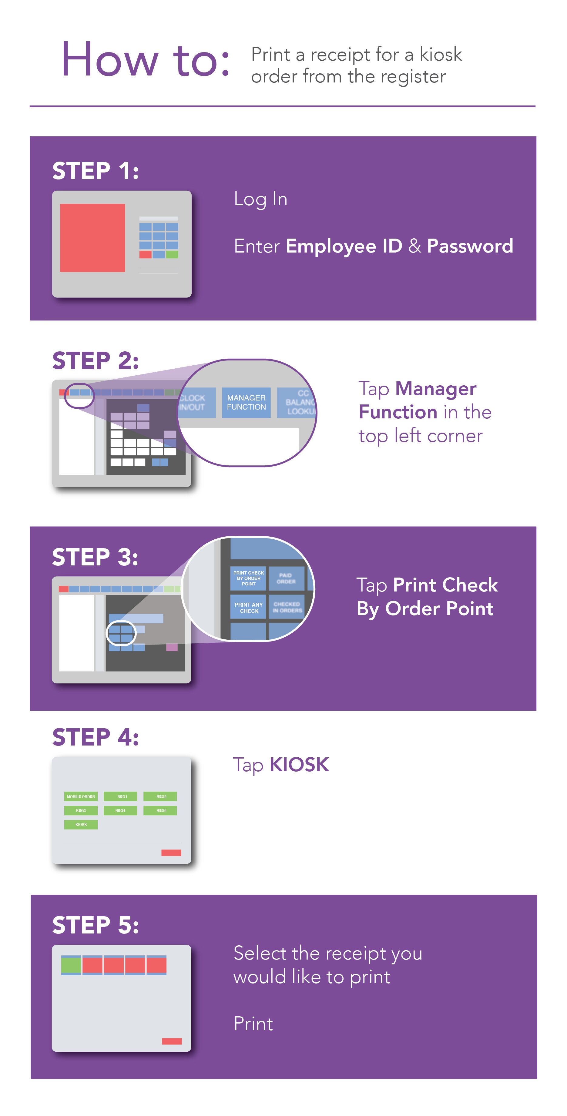
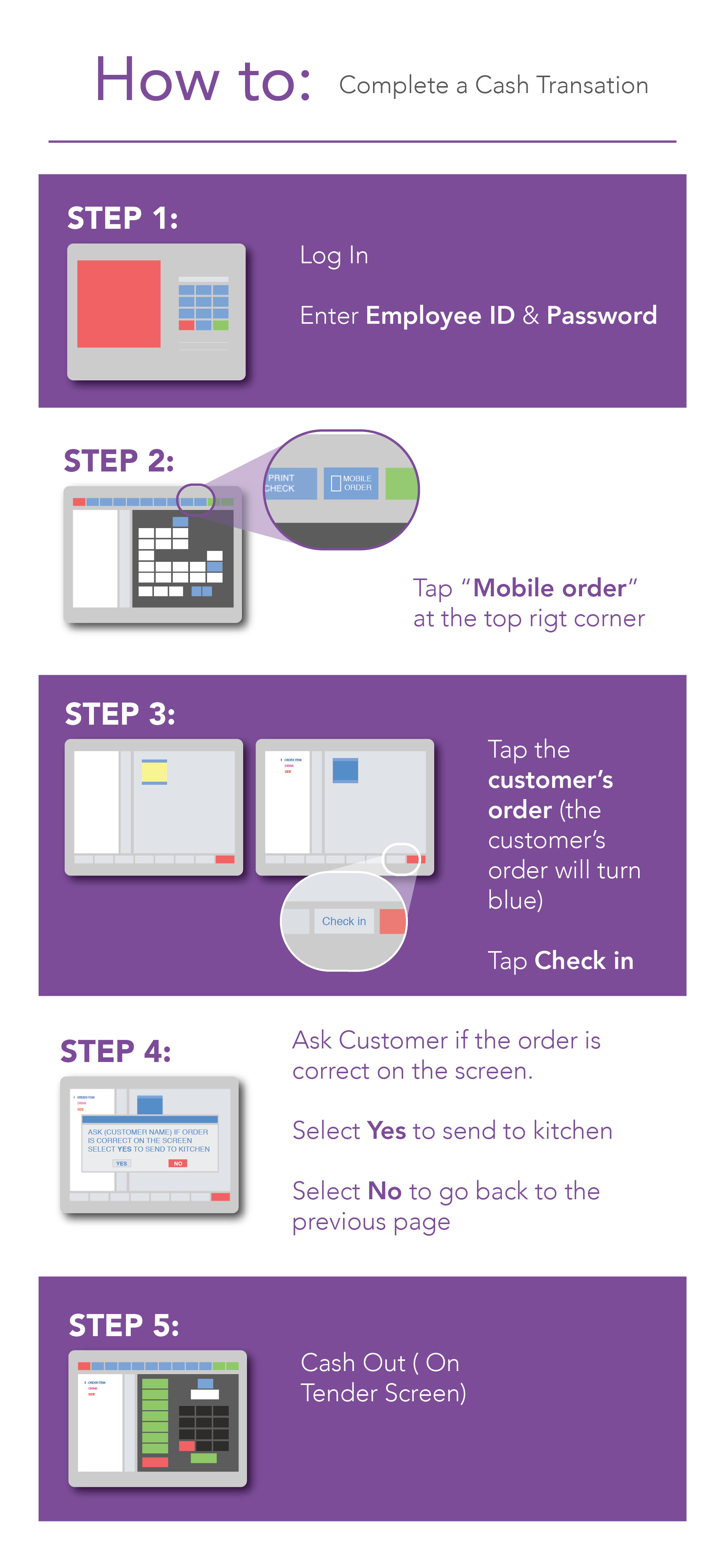
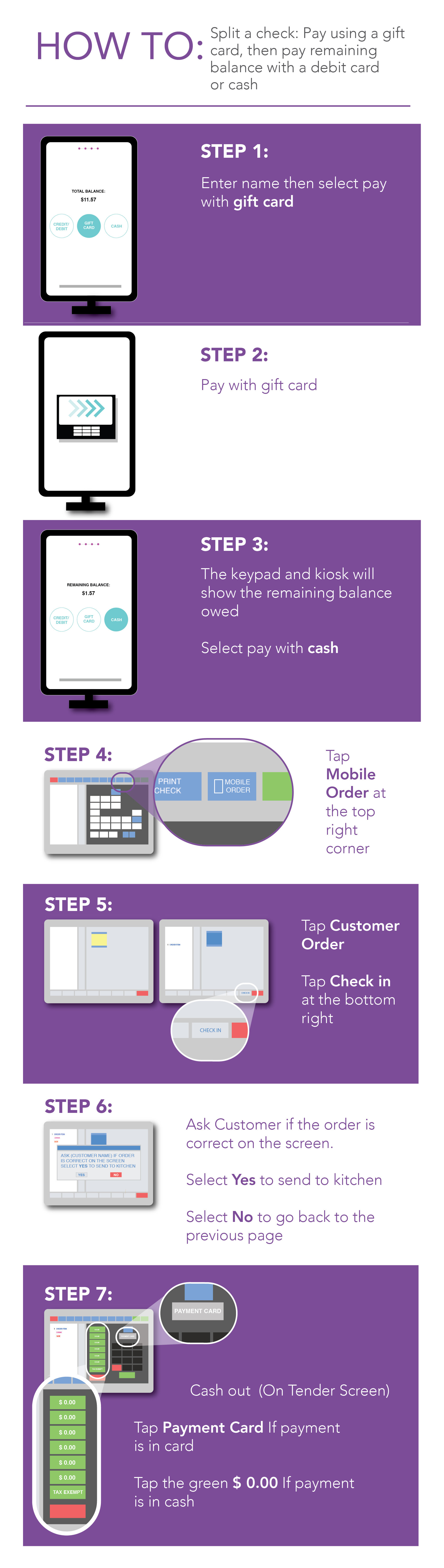
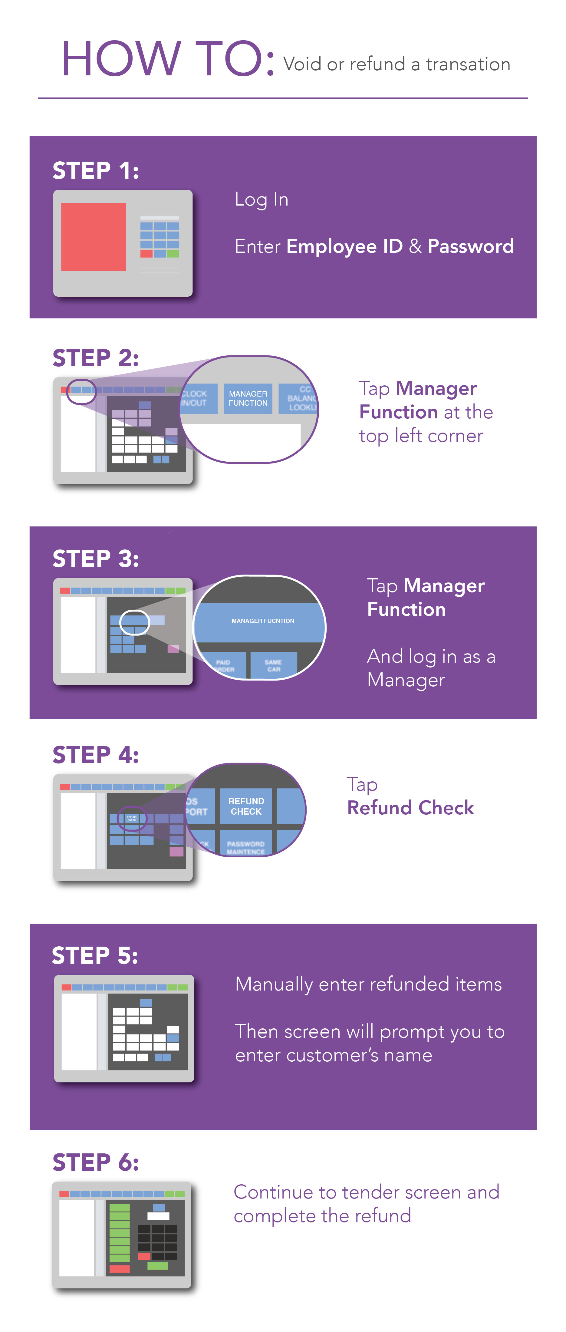
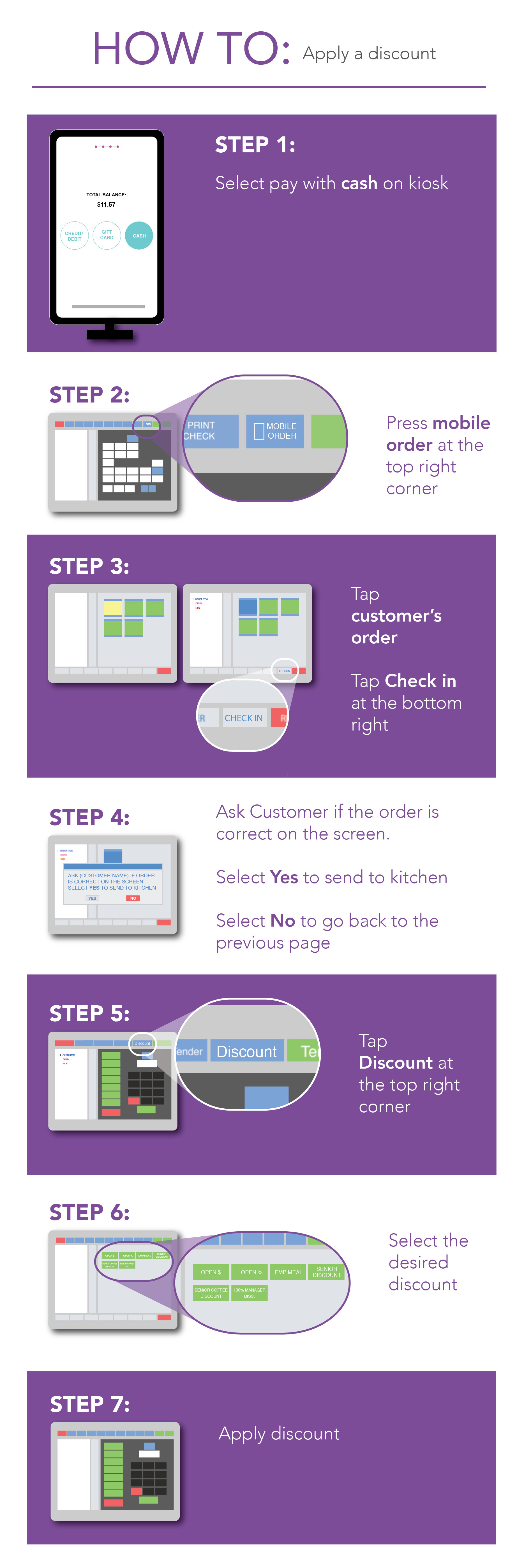
POS Infographic Series
After studying the POS system, I was tasked with making infographics for future Taco Bell employees on how to utilize the POS system. As you can see on the left, I created simplified step by step graphics to illustrate how to perform certain tasks on the POS System, such as: Print a Receipt, Complete a cash transaction, Split a Check, Void or refund a transaction, and Apply a Discount.
Overall Goal: To make ordering food on the Kiosks at Taco Bell Restaurants as user friendly, aesthetically pleasing, and functional as possible.
Taco Bell”s Innovative methodology of “fail fast” ( Try as many design options as possible, and if it is going to fail…. Fail Fast, and move on to the next design option) was a brand new experience for me and although it was a little different from standard UX practice, It was an Ideal situation to learn from. I got to experience UX, from angles I haven’t experienced before, got to test out my design, watch my designs go live, get critiques, and was given the opportunity to iterate my designs based on those critiques.
I also had the opportunity to get back to my roots and practice graphic design as well. As you can see from above I practiced Typography, Logo design, Iconography, Animation, and Information Design. It was an amazing opportunity where I got to combine graphic design and UX design, and was an invaluable learning experience.