
Lit college tour website redesign
Team: Jennifer Yoo (me,) Christine Le, Felix Tsai, May Lee
Tools: Adobe Illustrator, Sketch, Invision,
Platform: Web
Timeline: 1 Week of research, 2 Weeks of design, prototyping, testing, & iterations
Brief & Overview
This project was a pro-bono client work.
LIT College Tour is an online career and leadership platform designed to connect students and young professionals to mentors, internships, jobs, career development and more. The program bridges the gap between college and real world by bringing together an exciting mix of industry experts, educators, recruiters, mentors and entrepreneurs ready to share their insights and solutions for “Igniting Futures."
The client came to us with his website and asked for help specifically on the events page and home page. He initially told us that the website is not yet complete a lot of the pages don't have all the information. and you currently can't become a member through the website. Knowing this, he wanted us to completely redesign the site. He wanted to feel younger, brighter, and he wanted ideas on how to do the event page. and this is how were designed his website.
UX Process

What I did
Why I did it
What I learned

Research
Heuristic Evaluation
What I did
Evaluated the website to identify usability problems or UI problems.
Why I did it
To get first hand experience of how the website operates and to identify some obvious usability problem.
What I learned
Certain things didn't make sense. Things were not conventionally placed. And the site was not consistent

comparative and competitive Analysis
What I did
Created a chart comparing ourselves side by side with our competitors.Depicting which features certain company's have and don't have.
Why I did it
To get an understanding of why users would go to their
company instead of ours. To see what our company lacks.
and to see how other companies excel.
What I learned
Excluding student mentor, Lit college tour is not lacking by much. It is just not strategically placed or not completed.

interview + Affinity Mapping
What I did
Interview
Asking a series of questions to gain insights, information, and an understanding of problems.
Affinity Mapping
Wrote down all the comments that were said onto sticky notes and arranging it on a wall or board
Why I did it
Interview
To find target users, and to get specific targeted information from those users.
Affinity Mapping
To find patterns or trends within the multiple people interviewed. See if any problem was a reoccurring problem between multiple people
What I learned
Interview
There was no criteria in becoming a mentor or mentee. There is no success story. You cannot became a member through the website.
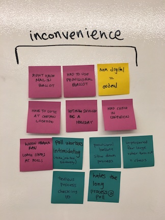
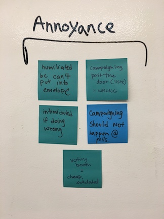
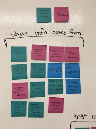
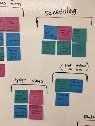
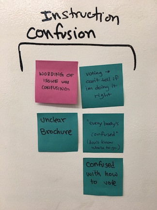
Affinity Mapping
People didn't trust this service. There was nothing on the website that indicated that you would benefit from joining this program
Screeners
Screeners, the initial interview to weed out users who are not our target audience. Mario ( the founder and CEO of Lit college tour actually set up these interviews for us so the screeners were not necessary.
Interviews
From the interview, I discovered that people don't use the website for its intended use. The MVP (minimum viable product) of this site is to get people to join as mentor or mentee. It currently didn't have that feature. thus people were only using it to look at event info. I discovered that because of its incomplete state. All the information that would normally be expected on the website, people were gaining them through word of mouth. This is not ideal, inefficient and quite self destructive for the program.
Affinity Mapping
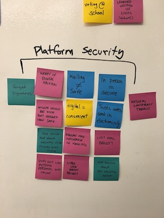
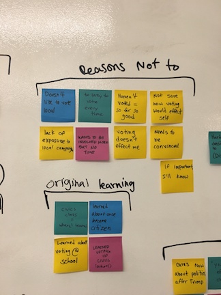
Affinity mapping is when we took all of what was said during the interview, putting them on sticky notes ( making sure we only put one comment on one sticky note) and arranging them strategically on a board or a wall.
Doing this, it makes each comment arrangeable (we can move it around) and it makes it easier to notice patterns or trends because you are able to group these comments together easily.
Doing this, we noticed that one major problem, other than the website initially not being complete, was there was nothing on this site to prove that this service worked, or that it helped anyone.
Thus it did not build the initial trust that it needed to build to get people to join this service/ program.
Quotes from interview
"I want the website to embody the vision that Mario ( the founder and CEO of Lit college tour) had for it. It does not do that now."
-Lynita Mitchell-Blackwell (Mentor)
I want quotes or stories from mentors saying what they learned and for them to say ...
" I learned A B C and i want to impart these learnings onto you."
-Lynita Mitchell-Blackwell (Mentor)
I would love to see follow ups from past participants. I would love to know what they do now. I want to know how I helped them and if i made a difference
-Lynita Mitchell-Blackwell (Mentor)
Proto Persona
What I did
Creating a visual/ (tangible ?) representation of the summation of our users.
Why I did it
To empathize with our users. and make sure we are designing/ creating for our persona.
What I learned
Our users are young, driven, and hard-working. They know that it is difficult to be in school or have a job and are proactively trying to set themselves up for success.

Task Analysis + Journey Mapping
What I did
Task Analysis
To observe any problems, confusions, or unexpected complications that may arise.
Journey Mapping
Creating a visual map that depicts emotional ups and downs our users experience while completing their task.
Why I did it
Task Analysis
Having users complete a task to observe how they go about completing that task.
Journey Mapping
To empathize with our users. Seeing their struggles during their task, helps create specific solutions.
What I learned
Task Analysis + Journey Mapping
Users felt betrayed by the state of the website. Because of its incomplete state and the incorrect placement of information users didn't trust the information on this site and didn't trust this program.
During the task analysis, which was to go on website and sign up to become a mentee, users were unable to do this due to the fact that the website is incomplete. Then I asked the users to go through the website and actively speak his opinions and We got some valuable insights.

User Flow
What I did
Created a flow chart of all the places in the website users struggle.
Why I did it
to have a visual representation of where users were stuck, confused, going back(redoing tasks) and leave the site altogether.
What I learned
A big problem is the incomplete state of the website. the biggest reason users were leaving is because they couldn't find the information they wanted.
Current User Flow
After watching the user go through the website we recorded all the places that our users were getting stuck, confused, going back (redoing tasks), and leave. It looked something like the flow below
Ideal User Flow
After creating a new site map, which we got from the information we got from the card sort (which you will read more about later) we expect the new and ideal user flow to look something like the flow below.


Problem Statement & MVP
Selena joins mentorship programs to get more networking opportunities because she wants to secure a job after college. However, Selena can’t find sufficient information on the LIT College Tour website to join and find a mentor. How might we help Selena to find the information she needs to make a decision?
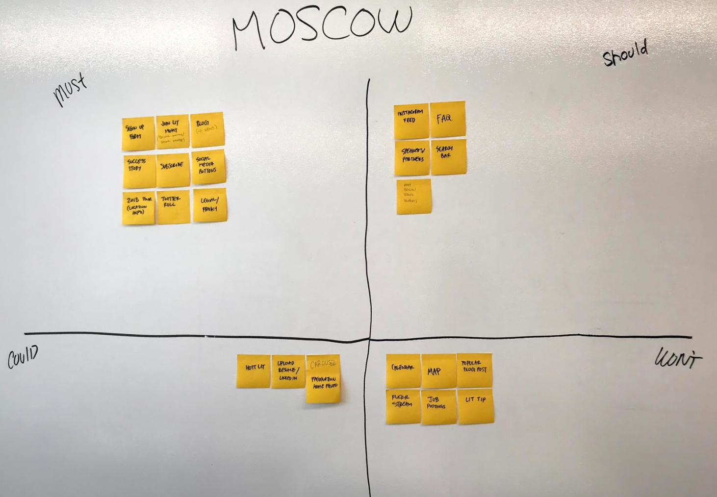
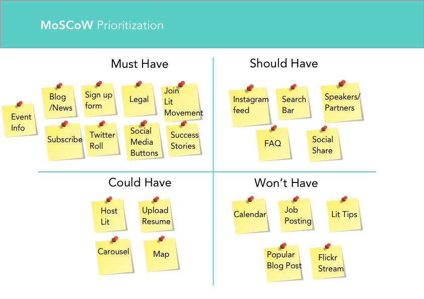
Feature Prioritization
What I did
Took all the features on this site and on competitor's site and determine whether it is a must have feature, should have feature, could have feature, or won't have feature.
Why I did it
It makes it easier to determine what your MVP is and what should be on your site. It also prevents featuritis (having too many features, and having too many unnecessary features.)
What I learned
That a lot of the features we were considering didn't fit in our scope and MVP and were eventually put in the could have or even won't have.
Feature prioritization is when you get all the features you are considering putting on your site and first considering the importance of each feature, then determining whether the feature is a must have, should have, could have, or won't have. For this website redesign something that surprised me was a criteria our CEO Mario gave us. He told us that social media social feeds were a must have feature, and keeping that in mind, we had to organize the other features around that.
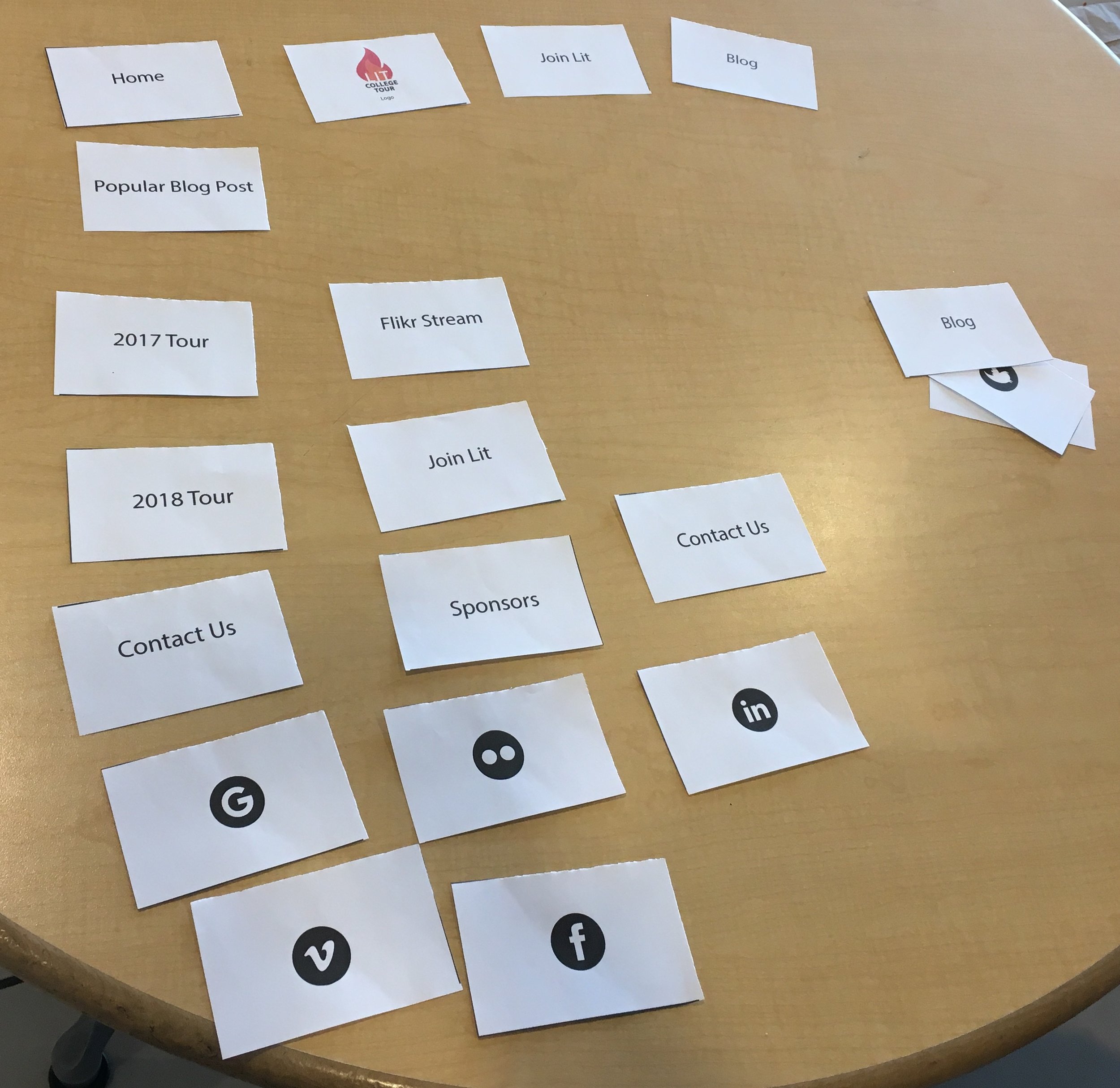
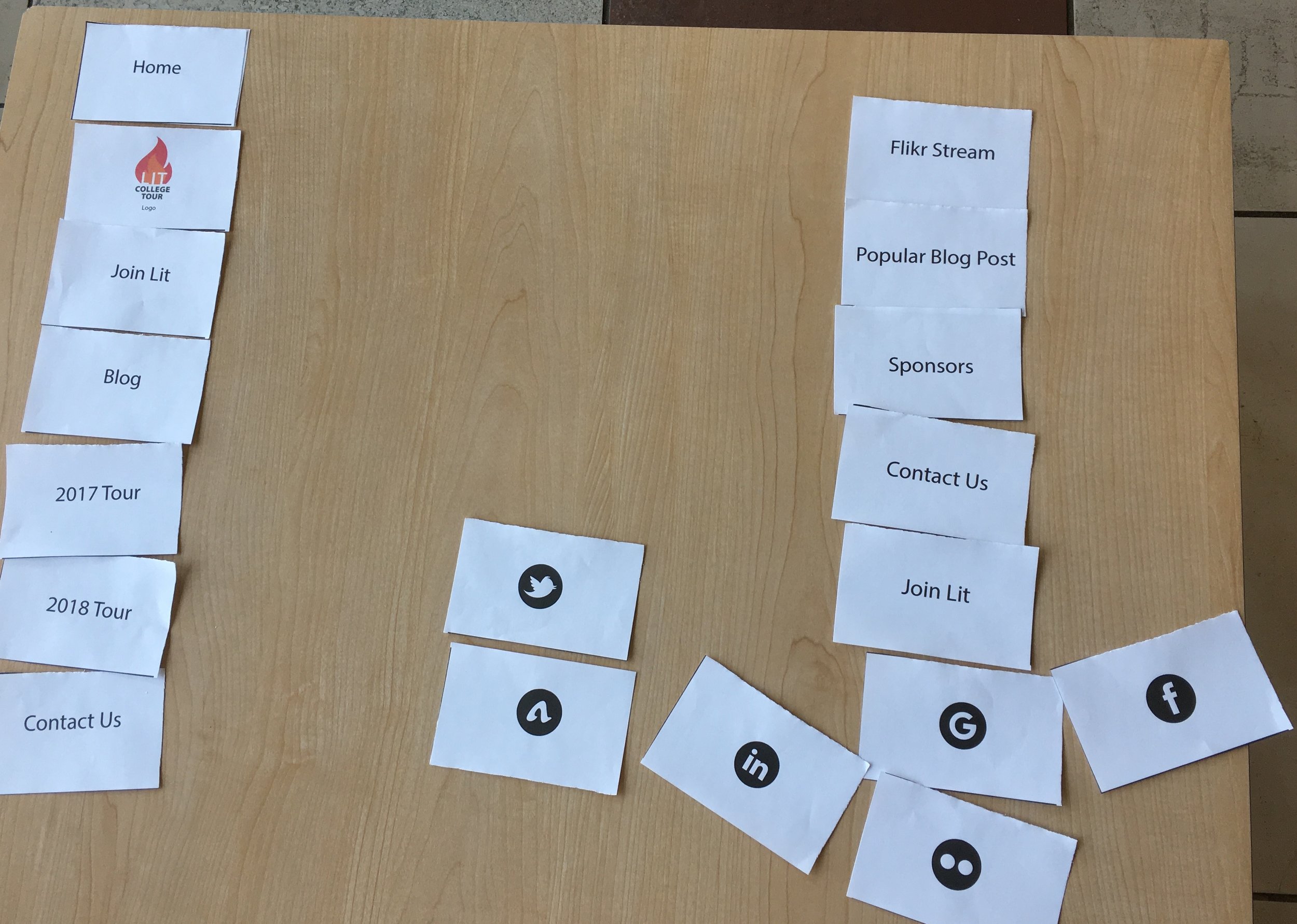
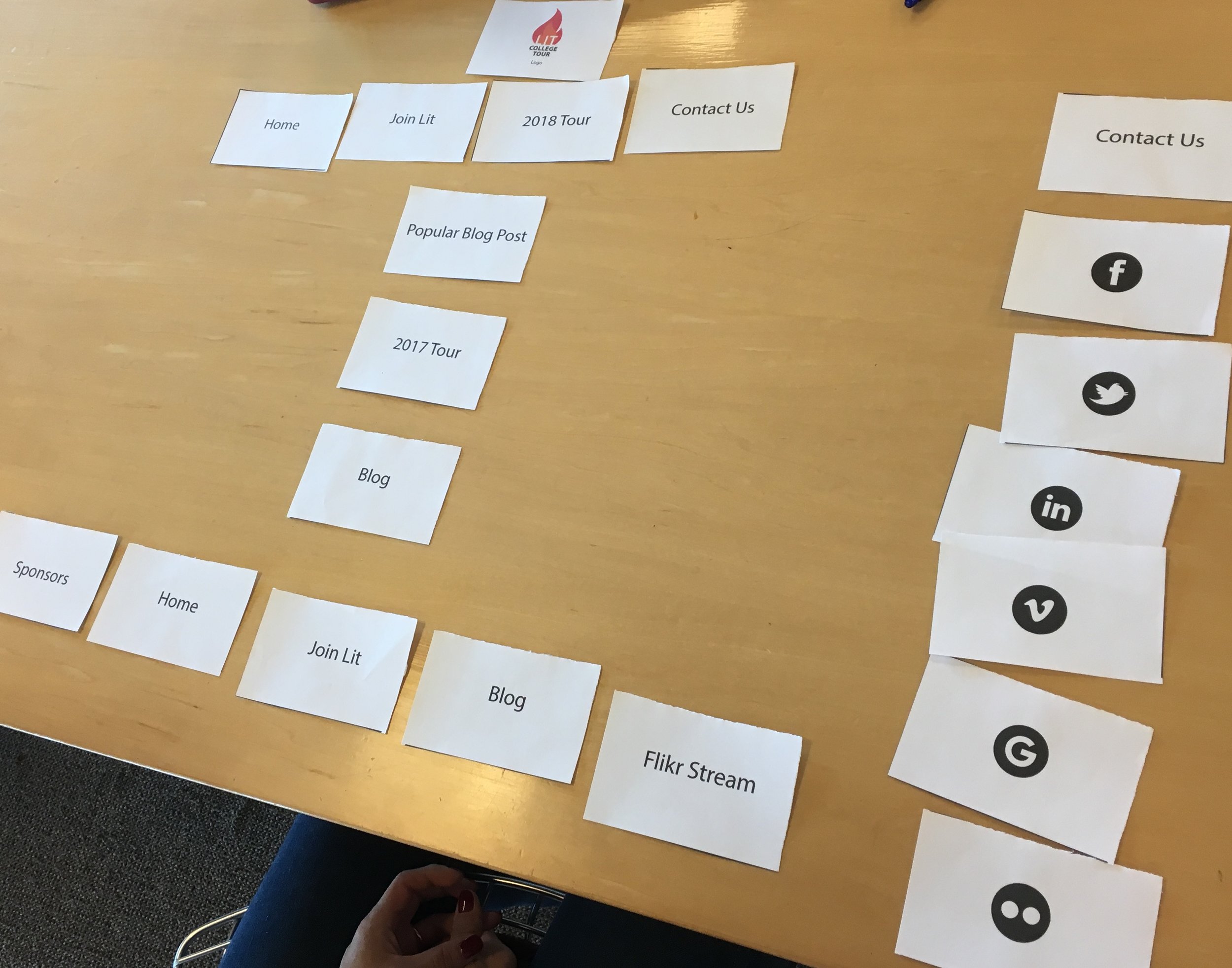
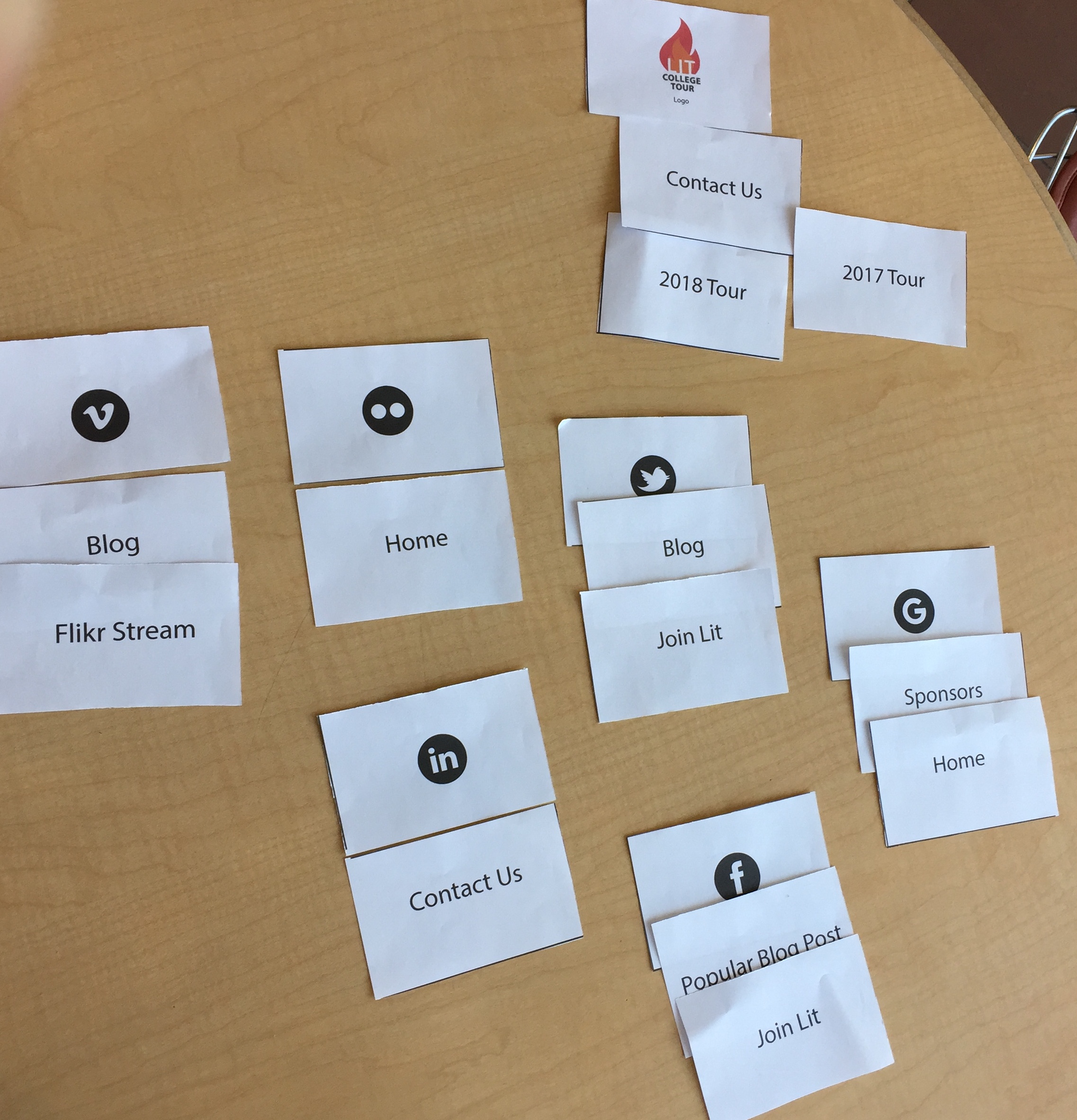
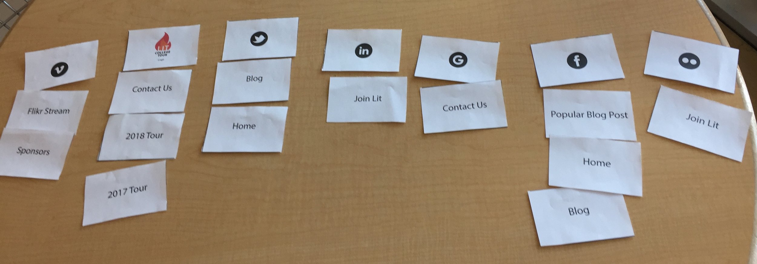
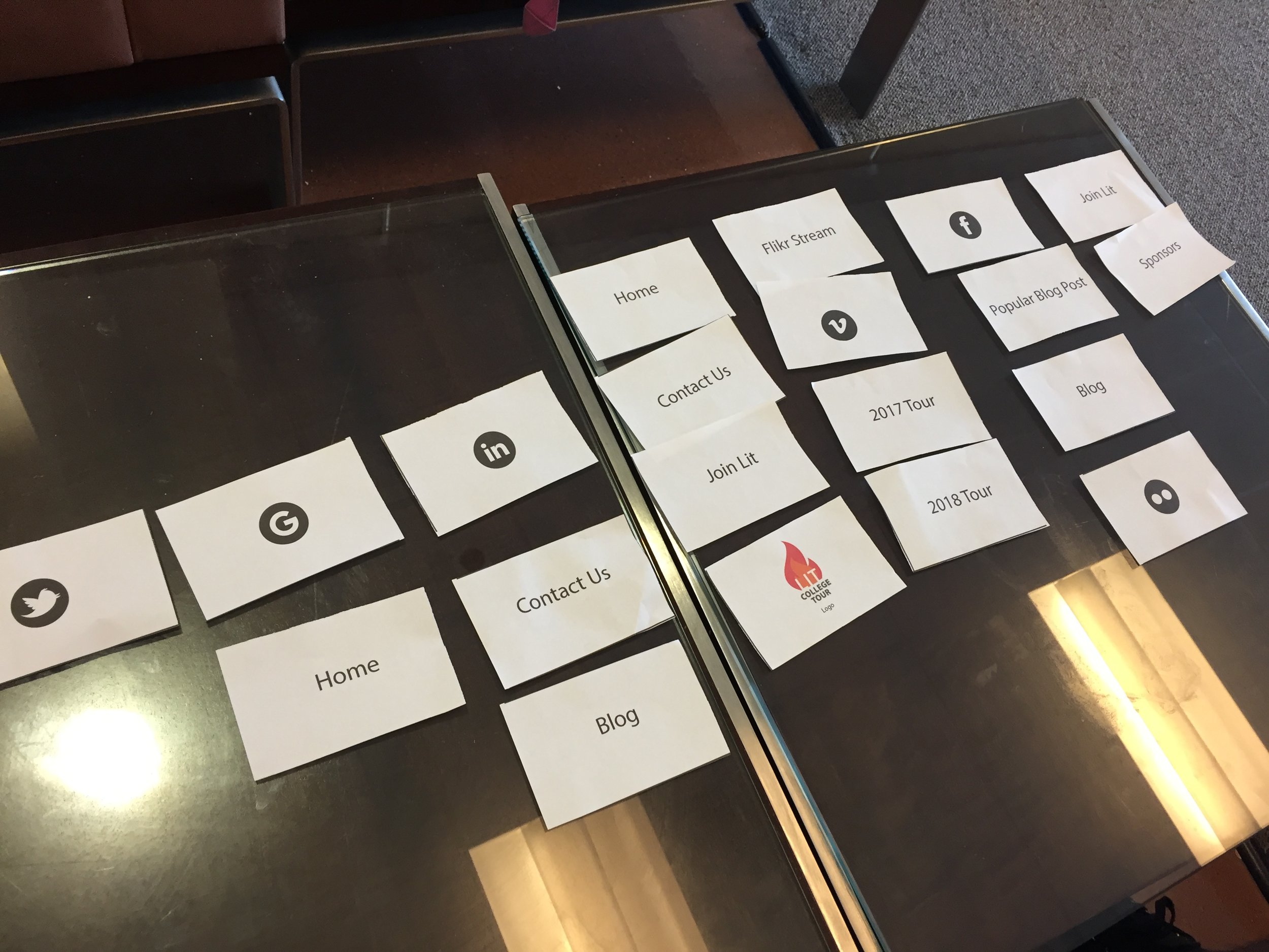
Card Sort
What I did
Putting all pages of a sitemap onto cards (sticky-notes) then asking users to organize it in a way that it makes sense to them
Why I did it
To observe the user's thinking and to find out why the
users organized it in the way they did.
What I learned
Users were confused by the names, and redundancies of the cards.
Next I moved into card sorts, in which I put every page of a website (sitemap) on note cards (sticky-notes). With as little influence from me as possible, we asked our users to organize these pages into main pages and sub pages in a way that made sense to them. Now taking the patterns that arose from this testing, and trying to incorporate as many inputs as possible, we made a new sitemap.
Site Map
What I did
Created a new Navigation Schema and footer, and made a visual blue print of those pages in a site.
Why I did it
To update the current navigation schema, and footer
with any changes we made to the names, color etc.
What I learned
People didn't understand why there were sub-navigation under home. The hierarchy of the navigation needed to be adjusted.
A sitemap is a map of your website. It holds a list of all your pages in a hierarchical system that shows you which sub-pages are nested within larger or main pages. What we did was, after gathering the information from the card sort, user interview, and C&C (comparing it to our competitors), we created a new site map with new names, and rearranged pages. These fixes were solutions to some of the confusions our users were facing while trying to complete their task. The biggest changes were changing "Tours" to "Events" , adding "Success Stories" and getting rid of "Home"


Design
Low fidelity / Wireflow + Testing
What I did
Initially sketched basic outline of
how the website will look like. basic shapes like squares as placeholder for images, text, button, logo etc.
Why I did it
Because it is a quick, cheap, and efficient way to start.
Allows you to make mistakes on the hand sketches
instead of on the expensive high fidelity.
What I learned
That you can communicate a lot with low fidelity wireframes. Even without color or text its still relatively clear what everything is.
Next we began flushing out some of our design. We began with low fidelity sketches because its cheap, quick, and a efficient way to get some basic ideas going.
Design Studio
What we did here is we held a design studio. (Click here to see photos) A design studio is when my team of ux designers and I met with Mario, our CEO and we had everyone draw sketches of each page. What this did is it kept everyone, including the CEO on the same page as to what direction we are moving on as we are moving into design
We also finalized the features as well as get approval of the changes we made from his original site to our redesign.
From these design studio low fidelity sketches (which is on the left) we drew up our low fidelity sketch. (which is on the right)
BEFORE
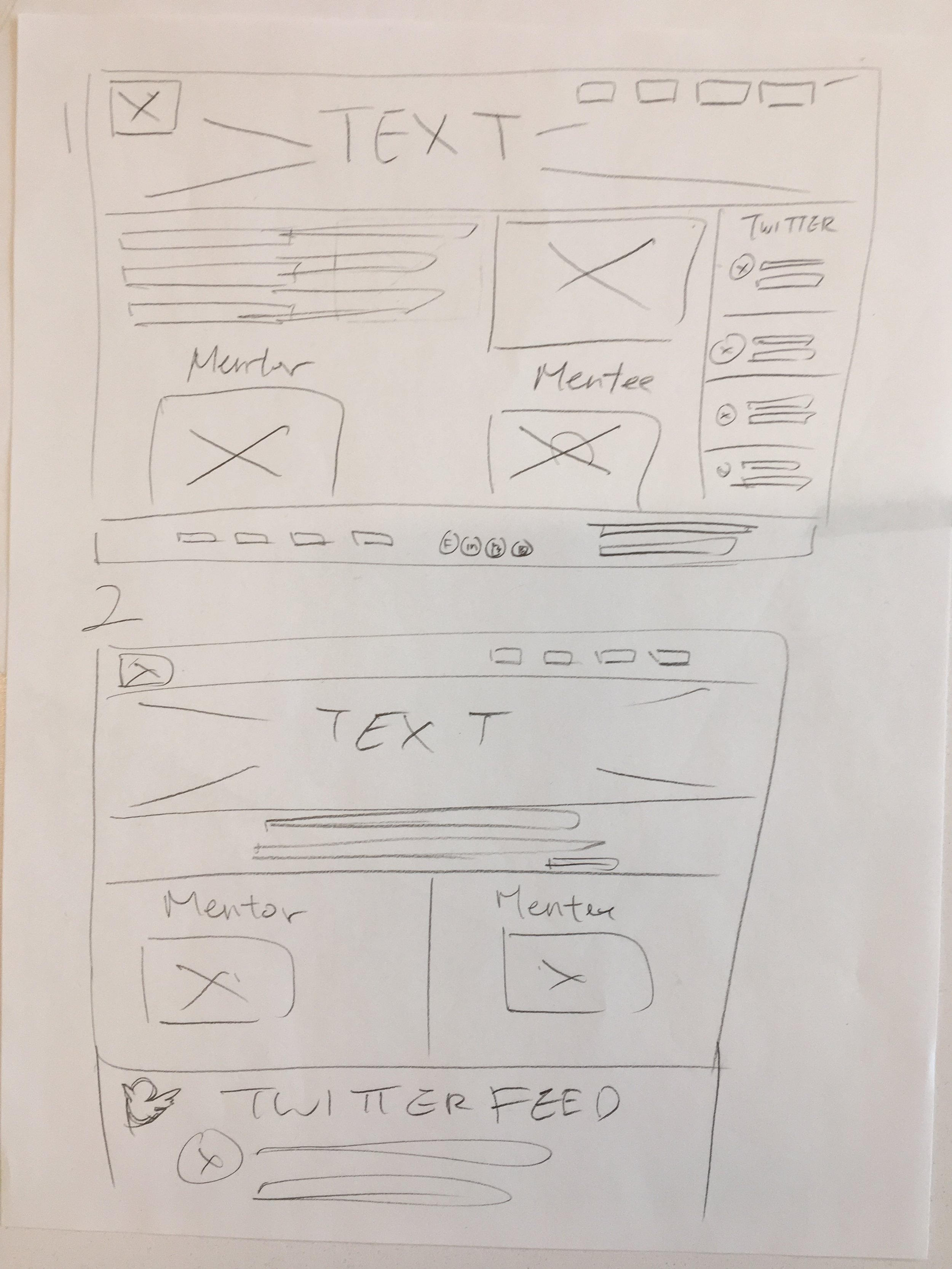
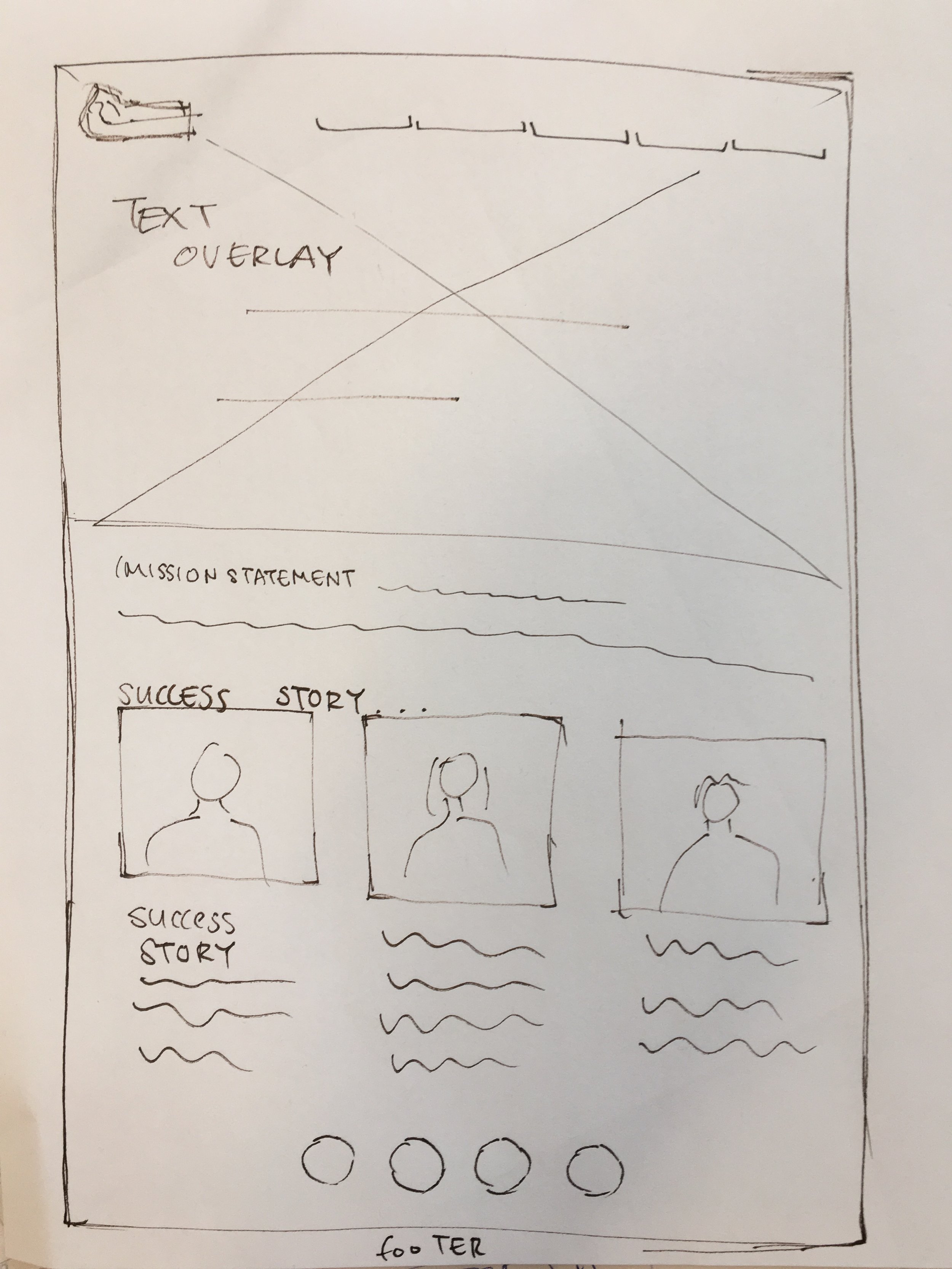
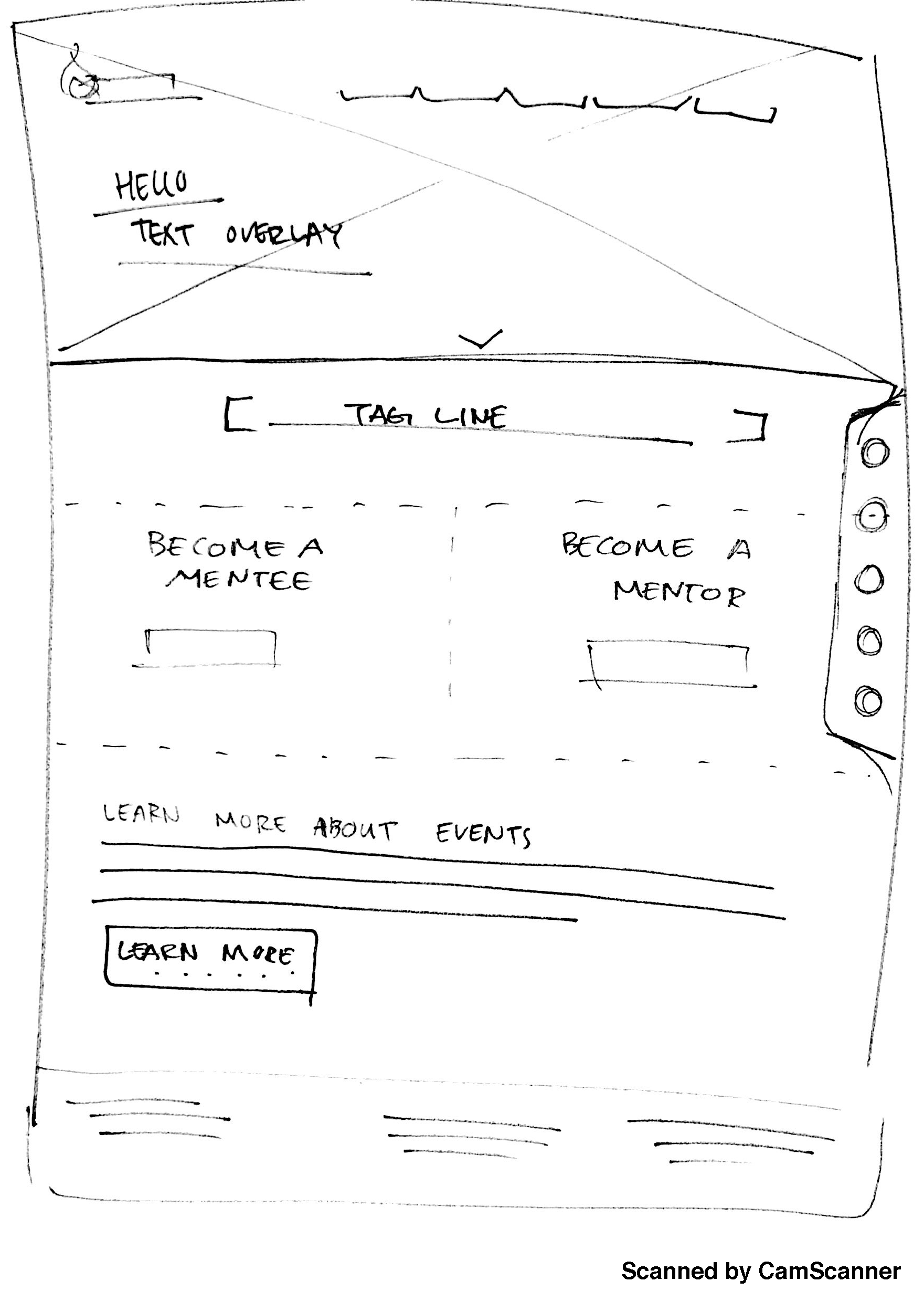
After

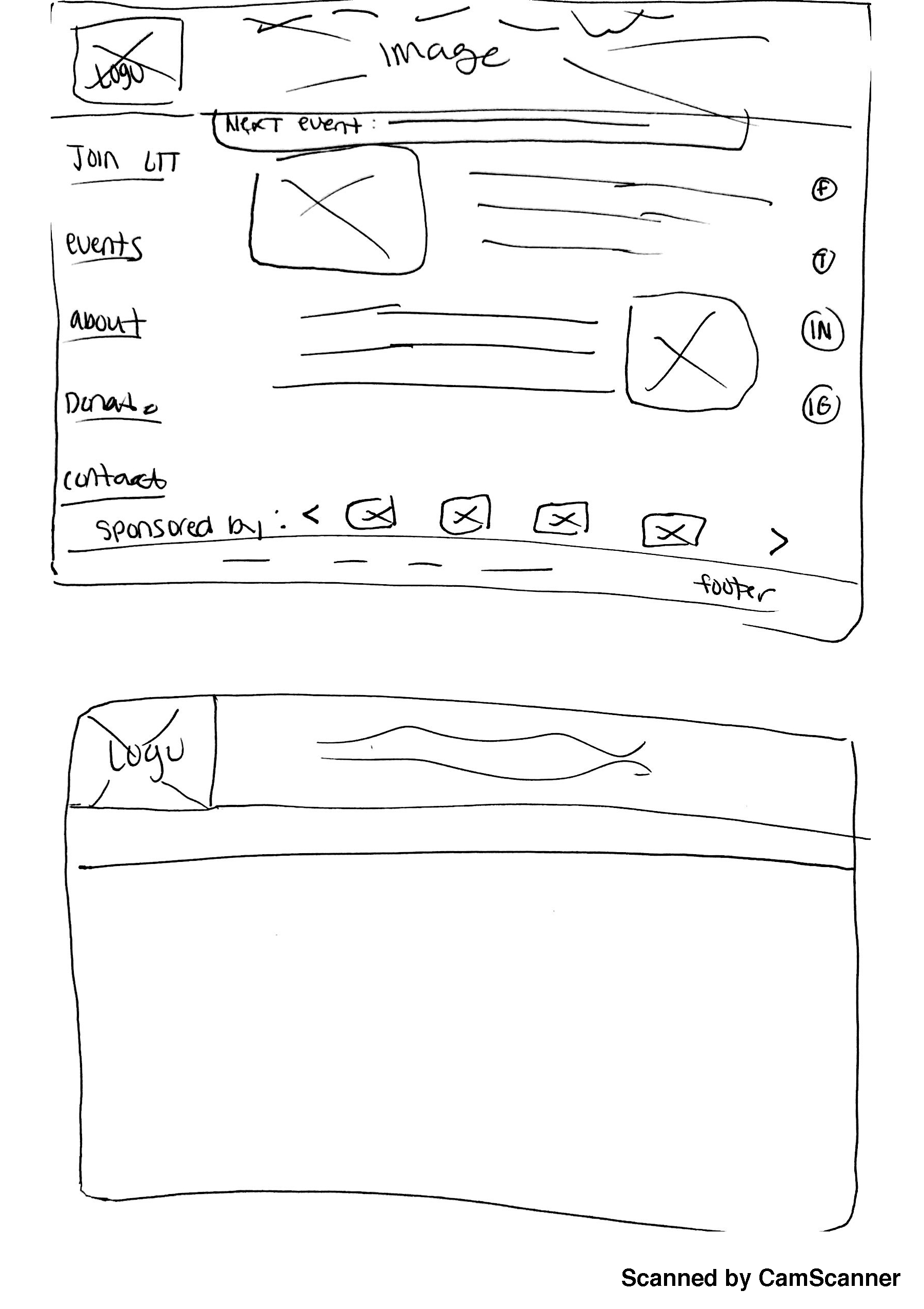
From there we moved to medium fidelity, which was digitizing these low fidelity sketches, and getting the information in there
Medium Fidelity + Testing
What I Did
Created the Medium Fidelity digitized sketch of the low fidelity.
Why I did it
After the Low Fidelity hand drawn sketches the next step is to digitize in black and white.
What I learned
The placement of the twitter feed was awkward and obtrusive. It also confused people.

Medium Fidelity Sketch
As you can see from the medium fidelity on the left, the hand drawn low fidelity sketch has been digitized. Placeholder images have been placed for images and all the components have been arranged, typed (lorem ipsum) and in black and white. From this we made a medium fidelity prototype and we tested it with users.

Medium Fidelity Test
"I feel that the twitter feed is obtruding page, it is in an awkward spot and the size of the twitter feed will make it hard to read the text on that feed"
-Matt
I don't understand why the twitter feed starts next to the join mentee and mentor buttons. related some how? Are they supposed to be related somehow?
-Lauren
From the testing we actually discovered that the majority of the users did not like the placement of the twitter feed. It was so skinny that any text on there was awkward and too small to read. The fact that it was constantly on the right, users said that it felt obtrusive. And lastly because it starts next to the join lit feature, and there is no correlation, it confused people and caused them to asked if they were somehow related.
From these valuable insights we decided to move the twitter feed. As you will see s in the high fidelity twitter has been moved to a different section of the home page.
High Fidelity + Ui Guide/ Annotated Wireframes
What I did
Created fully rendered out websites as it would look live. With final fonts, color, any design elements
Why I did it
To have it for the prototype and eventually the live website.
What I learned
When making the low fidelities, although there are no details like color or text, putting more effort into the low fidelity pays of when making the high fidelity.
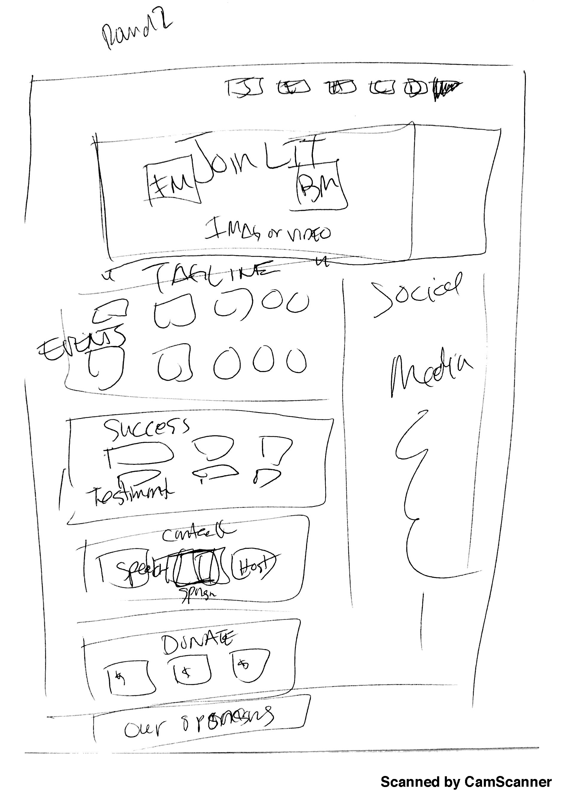
Lastly, we put in images colors, and overall more information, to make it high fidelity.
Here are a few high fidelity examples of the Lit college tour website redesign..
UI Guide/ Annotative Wireframes: file:///Users/Jennifer/Downloads/UI%20Guide%20Lit%20College%20Tour.pdf
For more please take a look at my prototype

Prototype
Prototyping/ User testing
What I did
Make an early sample, model, or release of a product ... which in this case was prototype of a website.
Why I did it
To test a concept or process or to act as a thing to be replicated or learned from.
What I learned
Its much easier testing the high fidelity prototype than the low. Users thought that the website was very plain so for next steps possibly embellishing it.
Then lastly we made our prototype. Taking the mid/high fidelity, May used Marval to make a prototype. We got a few users to test this high fidelity prototype for us and we got a lot of good reactions. Users said that it was much easier than the original site. Because we completed the website, users were also able to do tasks they weren't originally able to accomplish. And it overall looked younger, and cleaner.
The button below takes you to our prototype. Try it out!