
Identity Verification Systems at USCIS
Title: Identity Verification Systems at USCIS
Role: UX/UI Designer
Agency: USCIS, under DHS (ESIS Contract)
Timeline: April 2023 – Present
Tools: Figma, Jira, Confluence, Mural
Brief & Overview
As a UX/UI Designer under DHS, I worked on two identity management systems at USCIS—PCIS (Person-Centric Identity System) and IRQ (Identity Resolution Queue). These tools centralize identity data and help internal users verify, correct, and manage complex biographic and biometric records. The goal was to modernize legacy workflows, reduce inconsistencies, and increase user trust in the data.
Person Centric Identity Services (PCIS), an agency-wide effort to use enhanced business processes and emerging technologies to improve the reliability, accuracy, and completeness of biographic and biometric information across USCIS and other DHS immigration-related systems. The PCIS system compiles and aggregates this declared and obtained data through the use of algorithms and other sophisticated tools to establish an identity profile. The identity profile presents a single data set of consistent information about an individual’s identity history as essential support for adjudicative efficiency.
Identity Resolution Queue (IRQ); When discrepancies in data consistency are recognized within an identity profile or with a newly ingested transaction, PCIS relies on the Identity Resolution Queue to allow internal users to recommend changes to the data believed to be inaccurate. The Identity Resolution Queue is addressed by a human Identity Specialist who reviews and approves or denies the inbound transactions in source systems.

Example of PCIS with all data replaced with Lorem Ipsum for confidentiality

Example of IRQ with all data replaced with Lorem Ipsum
Challenges
Users—typically identity specialists and adjudicators—struggled with:
Overwhelming volumes of data
Unclear data accuracy
Fragmented legacy systems
Low trust and high cognitive load
Our challenge wasn’t just creating a usable interface, but fostering transparency, adoption, and efficiency in high-stakes environments.

informational banners for transparency

Warning banners for transparency

Critical banners to alert users on important information
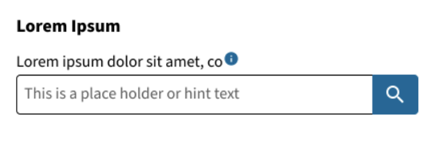
Tooltips and hint text assist users

Clearly labeled links and tooltips
Goals:
Centralize identity data from multiple legacy systems into a single platform (PCIS)
Enhance clarity and trust through intuitive UI and information hierarchy
Support adoption through continuous user research and iterative design
Ensure accessibility and compliance (USWDS, Section 508, legal)
My Role
As a core member of the UX/UI team, I collaborated closely with developers, product managers, and other designers to enhance and modernize the user experience for both PCIS and IRQ. My contributions spanned 3 major areas:
User Research - Supporting moderated usability studies and analyzing user feedback to optimize how questions were worded and presented.
UX Design - Creating low to high-fidelity wireframes, interaction flows, and component behaviors for complex form logic.
Developer Support and QA - Working closely with front-end developers to ensure faithful implementation, clarifying UX behaviors, and reviewing quality throughout the sprint lifecycle.

1. User Research
At the heart of our design process was a commitment to listening—deeply and consistently—to the people who would use these systems every day. We conducted regular research sessions and interviews with key internal users, including Identity Specialists and USCIS adjudicators, to gain a clear understanding of their workflows, tools, and day-to-day challenges. These conversations uncovered not only surface-level frustrations but also deeper insights into how the systems were impacting trust, efficiency, and decision-making.
Rather than rely on assumptions, we used this direct feedback gained from user research to inform every stage of our design process. Key insights were distilled into clear, actionable user stories that guided our sprint planning and prioritized the features that would have the most meaningful impact. This user-centered foundation ensured that each design decision was rooted in real needs.
We regularly interviewed USCIS identity specialists and adjudicators to deeply understand their workflows, tools, and pain points.
This uncovered critical insights around:
Trust issues with aggregated data
Navigation confusion
Cognitive overload from conflicting sources
User feedback directly shaped our sprint planning, user stories, and design priorities.

2. Design & Iteration
Design work on this project was shaped by two primary streams: direct requests from stakeholders/product owners, and user-centered initiatives driven by insights gathered during our research. In both cases, my responsibility was to translate complex requirements into thoughtful, usable solutions through a full design workflow—beginning with low-fidelity wireframes and evolving into high-fidelity mockups and interactive prototypes in Figma.
We adopted an iterative design approach, continuously refining our work based on direct user feedback and close collaboration with cross-functional teams. Every component we created aligned with the U.S. Web Design System (USWDS) to ensure consistency across DHS platforms and full compliance with Section 508 accessibility standards.
Before moving designs into development, we tested interactive prototypes with real users. This step was essential for validating our direction, uncovering usability issues early, and fine-tuning features—particularly in complex workflows such as identity resolution, profile flagging, and multi-source data review. These testing cycles allowed us to build more intuitive, trustworthy experiences that were grounded in user behavior and optimized for high-stakes decision-making.
I’ve created everything from low-fi wireframes to high-fidelity prototypes in Figma—especially for complex workflows for multi-source data solutions, resolution dashboards, and discrepancy flagging.
We followed an iterative process, constantly validating designs through moderated usability tests.
All while making sure components aligned with USWDS and accessibility standards.

3. Developer Handoff & Collaboration
Throughout the project, our UX team worked closely with multiple development teams to ensure a smooth and collaborative process. We began by aligning during sprint planning—discussing timelines, priorities, and developer capacity to make sure everyone was on the same page. Once designs were ready, we provided fully annotated Figma files and made sure all tickets were clearly documented with the necessary details for implementation.
We stayed actively involved during development, joining design reviews and QA walkthroughs to make sure the final product matched the design vision. When developers ran into edge cases or technical challenges, we worked with them to find practical solutions, adjusting our designs as needed.
This close, ongoing collaboration helped us catch issues early, stay flexible, and maintain a shared focus on delivering a high-quality user experience.
Once designs were ready, I collaborated closely with front-end developers:
Annotated designs in Figma
Participated in sprint planning and QA walkthroughs
Clarified edge cases and behavior logic
This ensured accurate implementation and rapid iteration within sprints.
Reflection
I learned to balance:
Regulatory and technical constraints
Legacy system complexity
User needs for clarity and trust
Working on PCIS and IRQ deepened my experience designing for complex, data-heavy government systems. This project reinforced the value of transparency, trust, and thoughtful UX when modernizing systems that people rely on for real-world decisions.